 Studio Elena
a new logistics route from China to Europe.
Arctic Line is a dedicated logistics service developed as an extension of the Proficargo brand, introducing an alternative shipping route between China and Europe via the Northern Sea Route.
The goal was to create a distinctive visual identity and a modern landing page while maintaining strong brand consistency with Proficargo.
The primary challenge was to communicate a complex logistics service in a simple and intuitive way. Instead of overwhelming users with technical details, the interface needed to clearly explain the route, highlight its key advantages, and guide potential clients toward making an inquiry.
Before starting the design process, research was conducted to understand the logistics industry, competitor websites, and the expectations of B2B customers. The focus was placed on information architecture — ensuring that every section answered a specific user question.
Rather than increasing the amount of content, the strategy was to prioritize only the information that supports decision-making, resulting in a clean, easy-to-follow interface.
The content was structured into a logical user journey, letting visitors understand the service step by step.
- 01Route introduction
- 02Interactive transportation map
- 03Key benefits of Arctic Line
- 04First completed shipment
- 05Pricing overview
- 06Contact & quotation
Arctic Line was designed as a natural extension of the Proficargo brand. The logo preserves the original typography, compass symbol and overall visual language, while a light-blue accent distinguishes the new service — keeping strong brand recognition while giving Arctic Line its own identity.
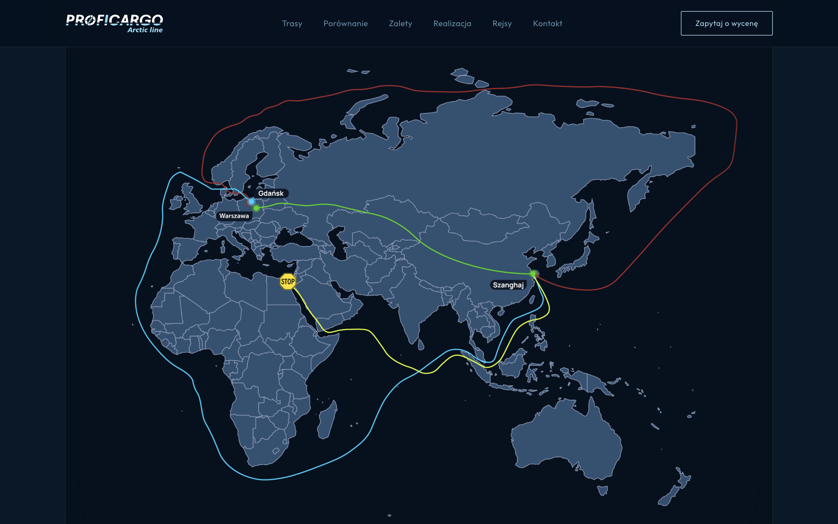
The visual direction combines a dark, maritime-inspired interface with modern editorial typography. Large maps become the main storytelling element, letting users instantly understand the route without lengthy explanations. Carefully placed blue accents create hierarchy and reinforce the brand.
The mark itself was extended for the new direction. The original Proficargo wordmark keeps its typography and structure, while a directional cut and a light-blue accent signal the Arctic Line branch — a clear before / after.

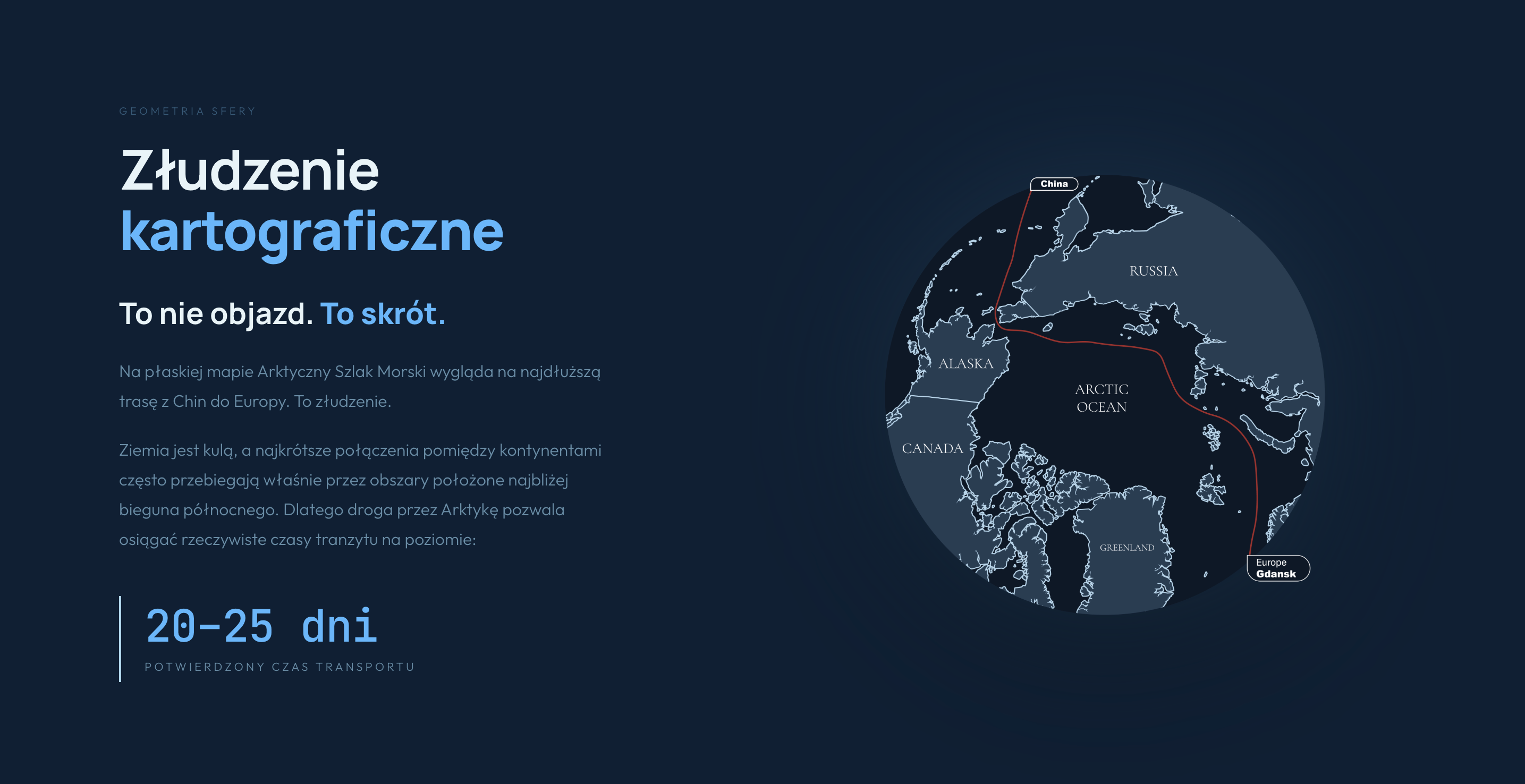
The cartographic story: on a flat map the Northern Sea Route looks like the longest way from China to Europe — an illusion. The globe reveals it as the shortest, with a confirmed transit of 20–25 days.
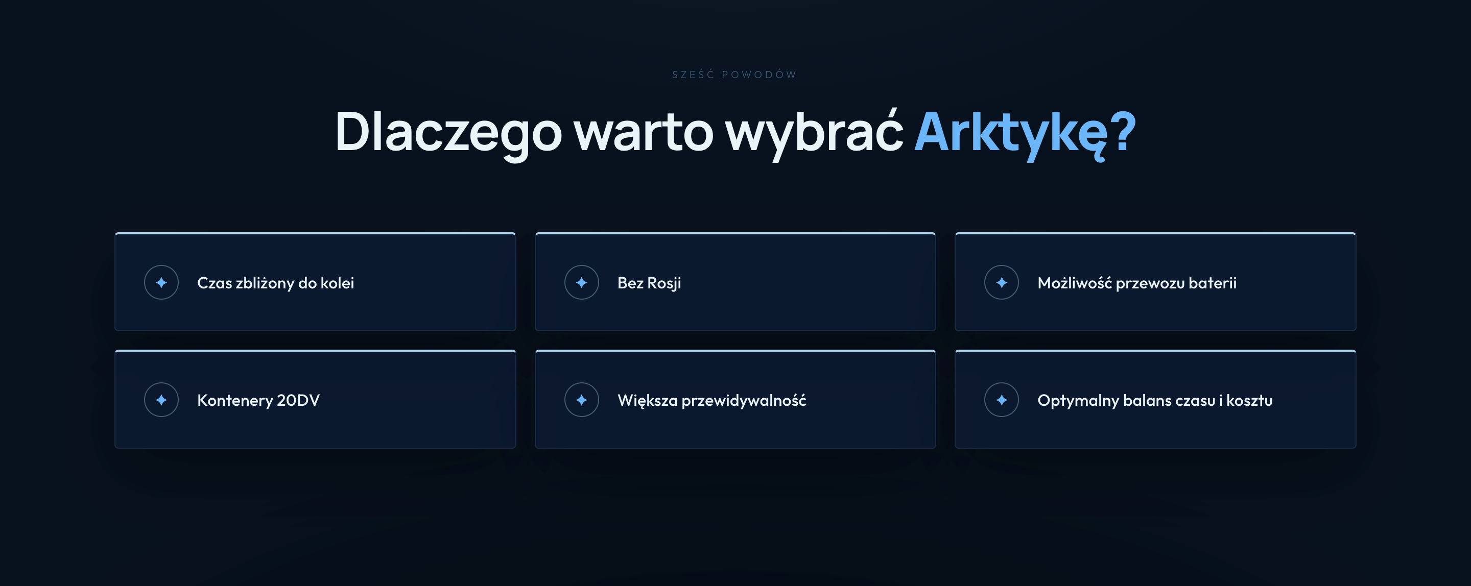
Six reasons to choose the Arctic route — rail-comparable transit time, no transit through Russia, battery cargo capability, 20DV containers, higher predictability and an optimal balance of time and cost.
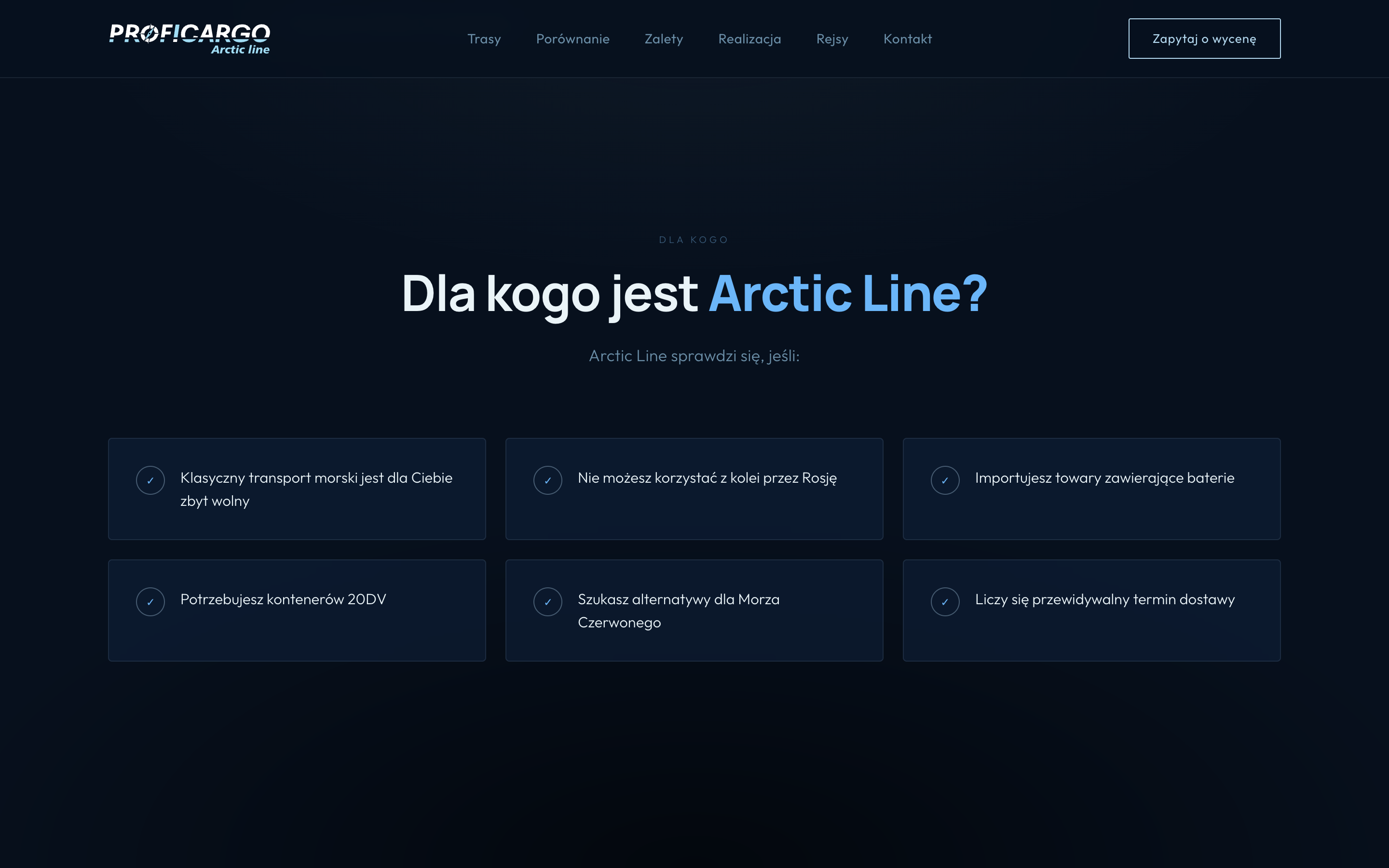
A qualifying section that lets B2B clients self-identify — from importers of battery-containing goods to those seeking a predictable alternative to the Red Sea corridor.
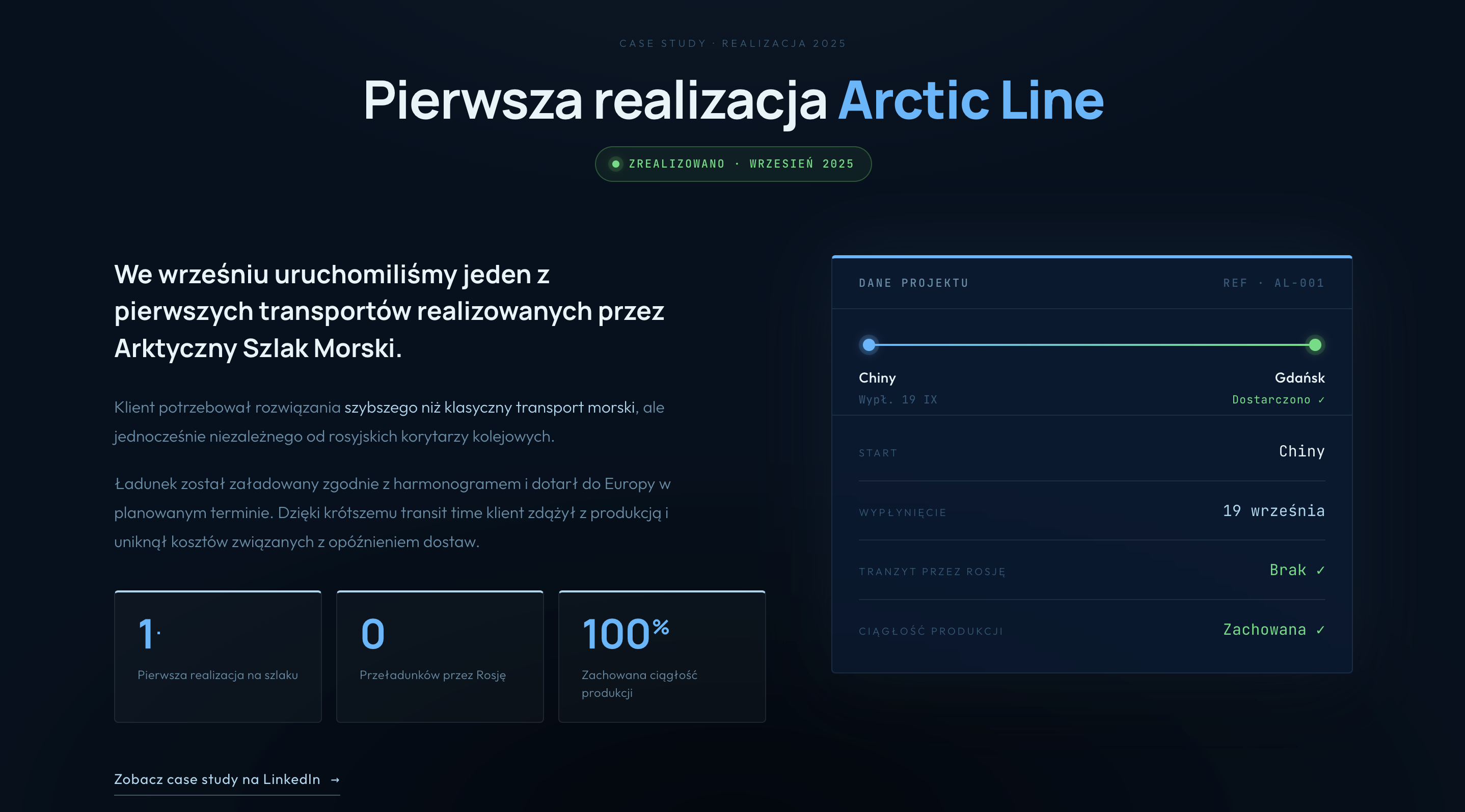
Proof over promise: the first live shipment on the route, delivered China → Gdańsk in September 2025 — zero transloads through Russia, production continuity preserved.
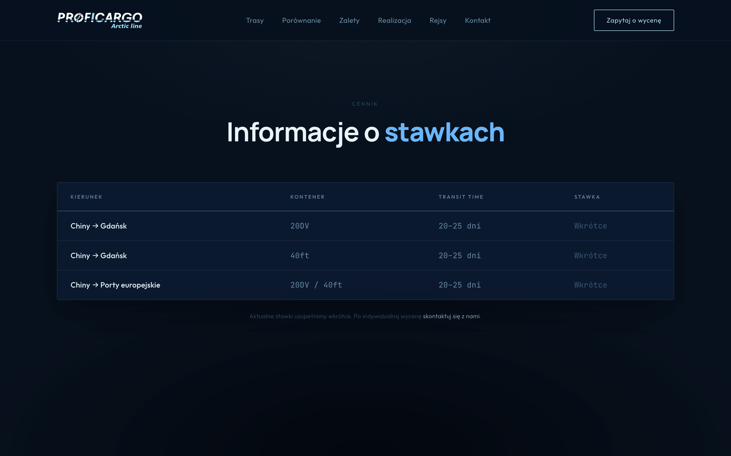
A clean rate table by direction, container type and transit time — kept honest with "coming soon" placeholders and a direct path to an individual quotation.
- Information-first approach
- Minimal and clean interface
- Strong visual hierarchy
- Custom route visualization
- Consistent brand extension
- Optimized B2B user journey
The final outcome is a modern landing page that introduces a new logistics service while remaining visually connected to the Proficargo ecosystem. Through thoughtful research, clear information architecture and a restrained content strategy, a complex transportation solution becomes an experience that is easy to understand and navigate.
A clean, business-oriented interface that strengthens trust and supports the growth of Arctic Line.